BANZA PASTA PACKAGING
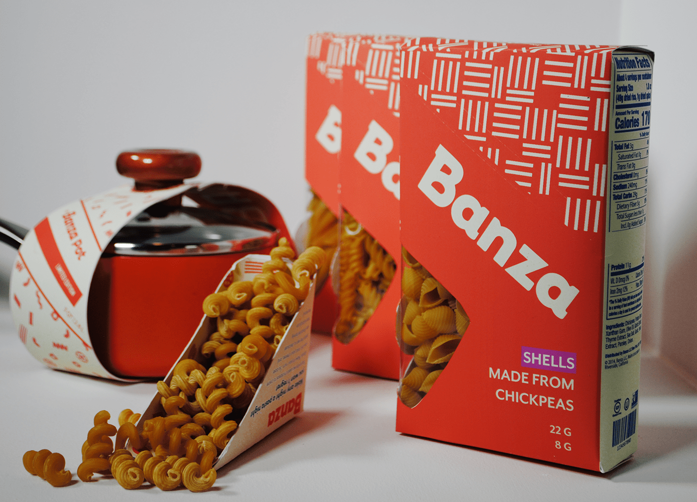
Banza has always succeeded at making any night pasta night! Their brand helps people feel good about what they are eating and get the nutrients they need. For this reason, I designed this packaging to highlight their purpose, while also creating a box meant to serve a major target consumer for Banza: women age 25-35 with lots of responsibilities and very little time!
As such, these new boxes are meant to expand, not change Banza’s branding and voice. The top of the box serves as a measuring cup! Consumers are able to measure out correct daily portions quickly. This will not only save time when trying to make a quick bite, but will also help people stay healthy! A lot of my research focused around working mothers who expressed the last thing they needed was more dishes and measuring, so I wanted to make sure I could solve this problem for them! I also tried to make every angle of the box informative for people in a rush. You can tell the noodle type from the sides through both a wraparound transparency window and the color of their signature chickpea, which aligns with the color system created for each noodle type. Once users become familiar with Banza, picking the right box should barely take a glance at the store. Lastly, the crosshatching pattern used on the box is meant to visually communicate Banza’s features of 2x the protein and 4x the fiber of regular pasta by using lines of twos and fours, which is a detail that will bring in health-focused consumers.
For the specialty product, the Banza pot was created! The Banza Pot is a personal portion pasta pot in Banza’s signature orange. It has an easy pour spout built in and is perfect for a quick healthy meal.


